Engineering18 min read
Good UX, bad UX: what visitors feel and what it costs you
What UX means in 2026, the common mistakes that make visitors leave quietly, what bad UX costs you, and gentle fixes, accessibility included.
Loïc Simon
Fullstack Developer
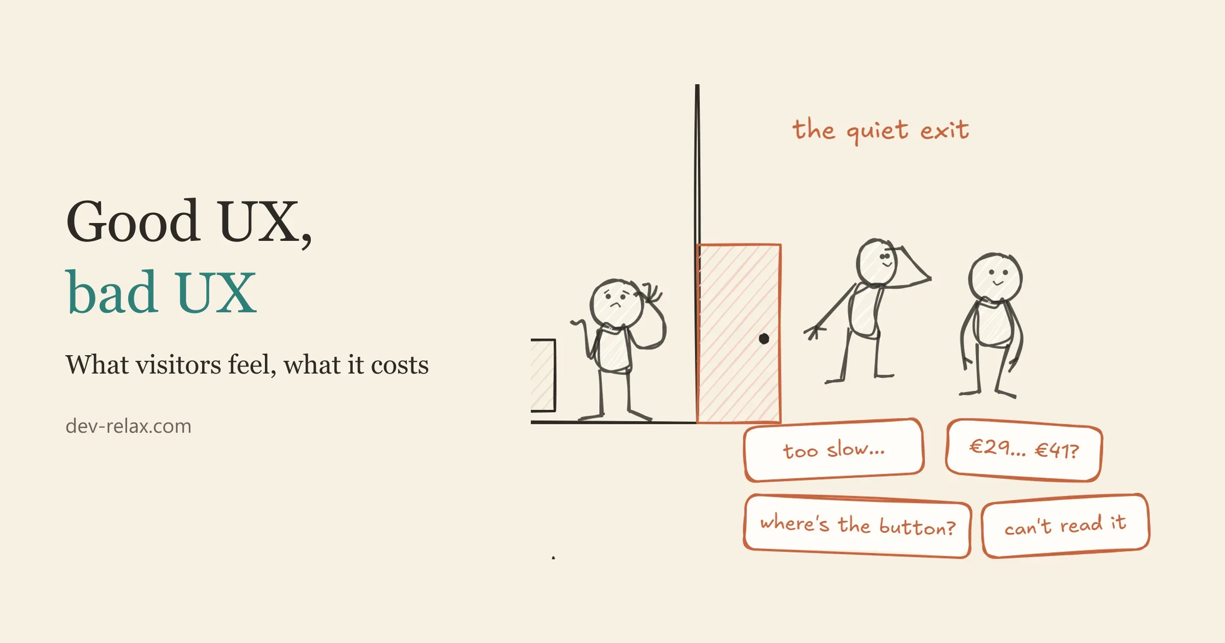
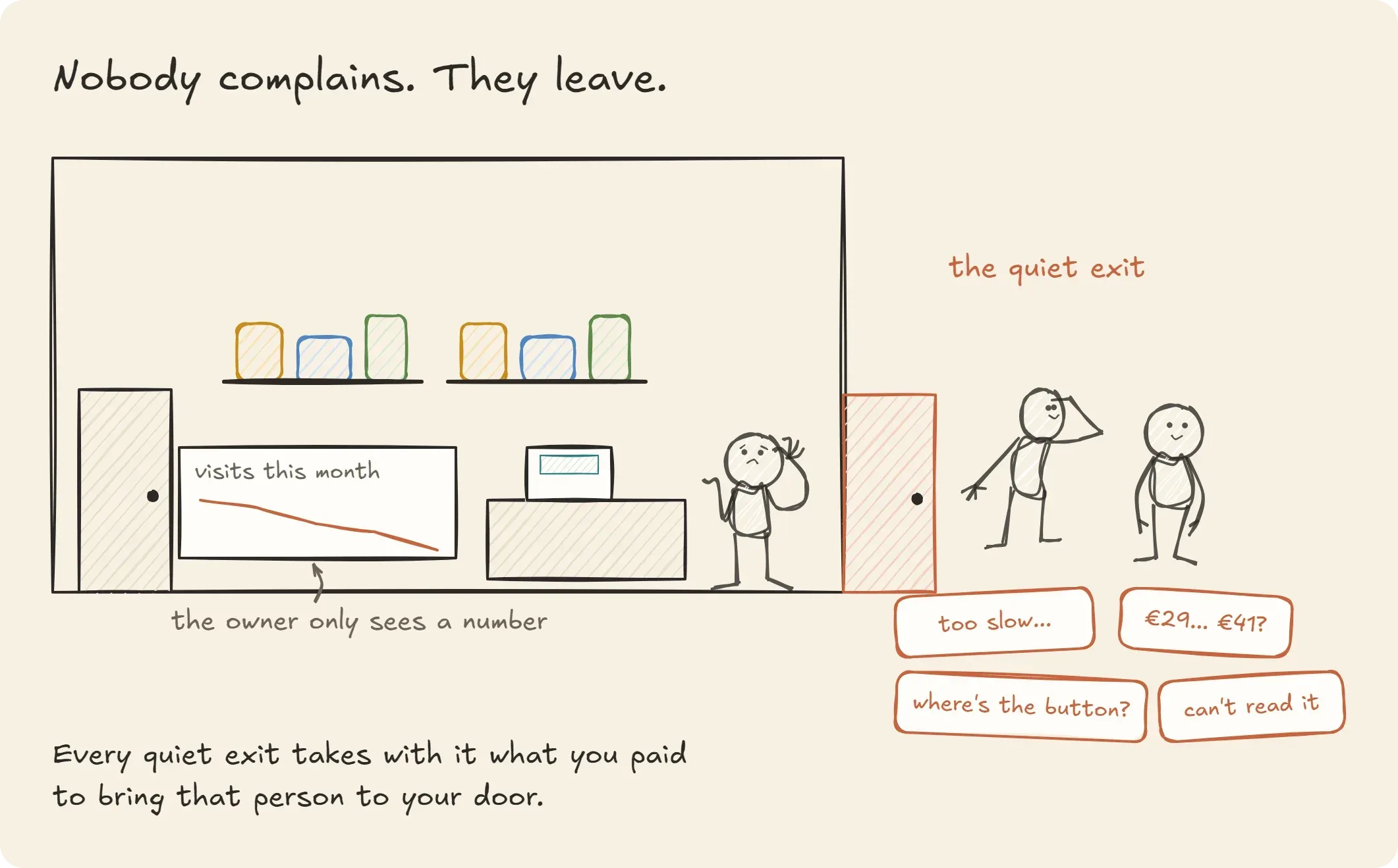
Nobody writes to a website to say "your button was hard to find, so I left". They just leave. The site never hears about it, the owner never hears about it, and the numbers drop a little without anyone knowing why.
That's the strange thing about user experience (UX): when it works, nobody notices, and when it doesn't, nobody tells you. This post is about that quiet gap. What good and bad UX look like in 2026, what each one costs, and what to do about the common mistakes, including for visitors who need a site to be a bit more careful with them.
One thing first: this isn't a post about bad designers or bad clients. Most of the mistakes below were fine choices when they were made. The web keeps changing, phones keep changing, and the apps people use every day keep teaching them new habits. A site that felt modern in 2018 hasn't become wrong; the people visiting it have moved on. We'll look at what moved, and how to catch up gently.
UI and UX, explained with a shop
Picture your website as a small shop on a street.
The UI is everything you can see from the pavement and inside: the shop front, the sign, the shelves, the price tags, the colour of the walls. It matters. A dusty sign or a tag nobody can read makes a poor first impression.
The UX is the walk. A person comes in with something in mind (a price, a phone number, a gift, an appointment) and either finds it, understands it and leaves with it, or doesn't. UX covers the whole walk: how long the door takes to open, whether the shelves are where you'd expect them, whether the price on the tag is the price at the till, whether someone at the counter answers kindly when you're lost.
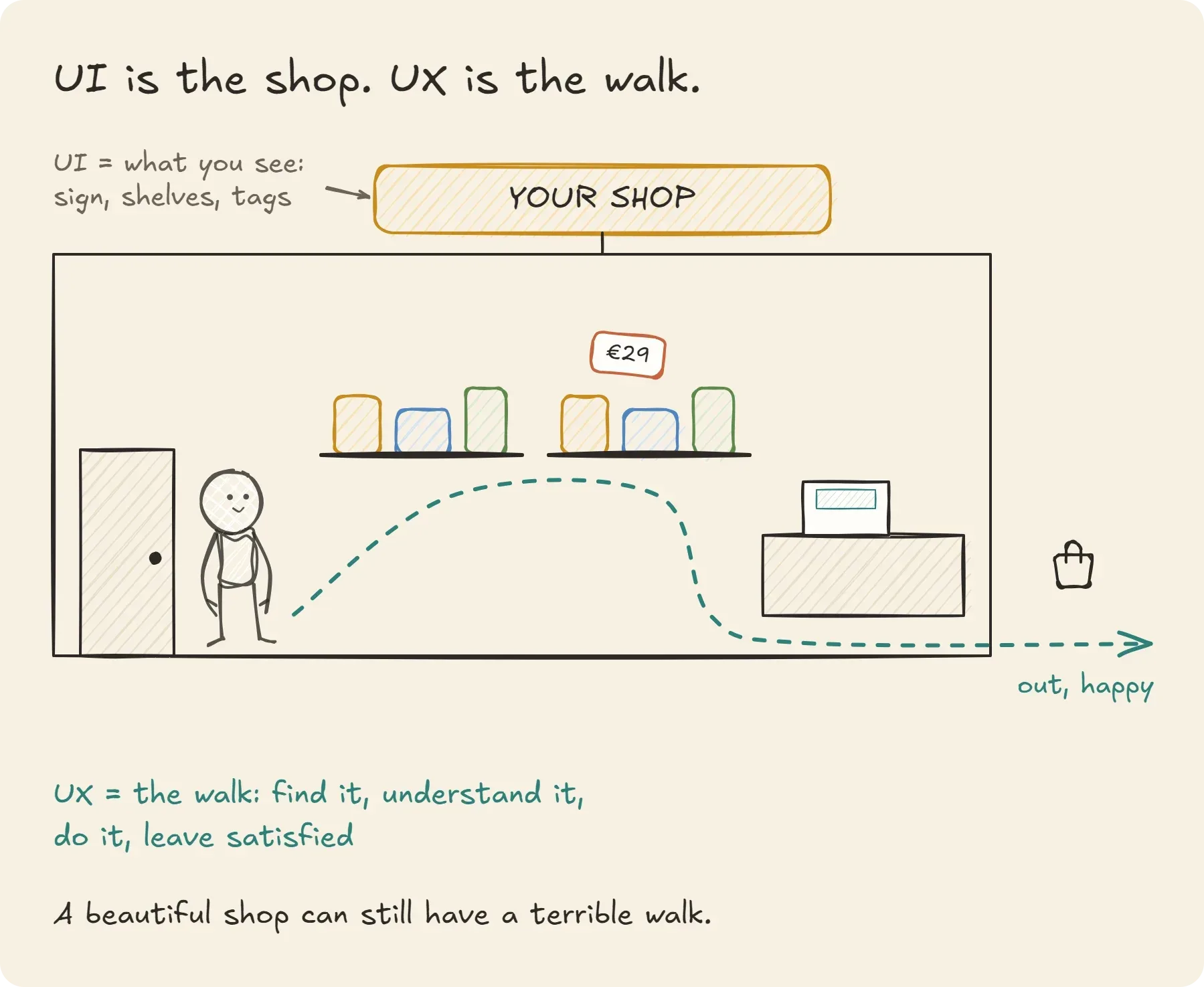
You can have a beautiful shop with a terrible walk (gorgeous shelves, but the till is hidden upstairs), and a plain shop with a lovely walk. The best ones have both, but if you have to choose where to spend first, spend on the walk.
A useful rule from Nielsen Norman Group, a UX research firm, explains why the walk matters so much: people spend most of their time on other products, not yours, so they arrive expecting yours to work like the ones they already know (NN/g, 10 Usability Heuristics). Your visitors learned where the basket goes, how a menu opens and what a grey button means somewhere else. That's why expectations shift over time even when your site doesn't: the street around your shop keeps changing.
This isn't only true of shops. A plumber's site, a yoga studio's booking page and a lawyer's contact form have the same walk: someone arrives with a question and wants the answer, a phone number or a free slot without hunting for it. Plain menu labels ("Prices", "Book", "Contact") beat clever ones every time.
Nobody complains, they leave
Bad UX has one sneaky property: it's silent. In a real shop, you'd see a customer frowning at a shelf. Online, you see a number in an analytics dashboard, if you look.
The clearest numbers come from online checkouts, because they're measured to the click. Baymard Institute, which has studied e-commerce usability for more than a decade, puts the average documented cart abandonment rate at 70.22%, from 50 studies (Baymard, Cart Abandonment Rate, updated September 2025). Some of that is normal: lots of people put things in a basket just to look. But when Baymard asks US shoppers why they gave up during checkout, after setting aside the "just browsing" crowd, many of the reasons are UX:
- 40% left because extra costs (shipping, tax, fees) were too high;
- 19% didn't trust the site with their card details;
- 18% were asked to create an account;
- 17% found the checkout too long or too complicated;
- 17% hit errors or a crash;
- 12% couldn't see the total cost up front.
None of those people wrote an angry email. They closed the tab. Baymard estimates that the average large online shop could increase its conversion rate by 35.26% just by fixing checkout design issues of this kind.
Speed works the same way. In a study for Google, Deloitte looked at more than 30 million sessions on the mobile sites of 37 European and American brands and found that improving speed by 0.1 seconds raised retail conversions by 8.4% and the average order value by 9.2% (Deloitte, Milliseconds Make Millions; web.dev case study). A tenth of a second is about the length of a blink.
What you lose, and what you gain
Here's the same shop, two ways. The left column isn't "bad people"; it's what happens to most sites that nobody has walked through in a while.
Moment | Bad UX | Good UX |
|---|---|---|
First seconds | Slow, jumpy page; the visitor waits and wonders | The page answers at once; the visitor starts reading |
Finding things | Clever labels, hidden menus | Plain words, things where people expect them |
Forms | Many fields, account required | Few fields, guest option, autofill works |
Price | Surprises at the last step | Total visible early |
Errors | "Invalid input", form wiped | Says what's wrong, keeps what was typed |
On a phone | Tiny buttons, zooming around | Thumb-sized buttons, one column |
What you lose or gain | Sales, leads, trust, support time, legal risk, and the cost of ads that bring people to a door that sticks | More of the visitors you already pay to attract, fewer support emails, a site more people can use |
That last row is the one I'd underline. Bad UX doesn't only lose the sale you see. It wastes the money you spent bringing people to the door: every ad click, every hour spent on SEO, every flyer with your address on it.
What matters most in 2026: seven mistakes and their fixes
Here are seven common mistakes, the kind I look for first when I take over an existing site, each with why it happens (usually for a good reason) and a gentle fix.
1. The page loads, but doesn't answer
What it looks like: the page appears, you tap a button, and nothing happens for a moment. Or you tap, the layout jumps, and you've hit the wrong thing.
Why it happens: sites grow. A chat widget here, a tracking script there, a carousel everyone liked at launch. Each one is small; together they keep the browser busy.
The fix: measure how fast the page responds, not only how fast it loads. Paste your address into Google's free PageSpeed Insights and look at INP. Google changed its own yardstick for this in March 2024: one of its Core Web Vitals is now INP (Interaction to Next Paint), and a page counts as good when it responds to taps and clicks in 200 milliseconds or less (web.dev, INP becomes a Core Web Vital). The same report shows CLS, which tracks the page jumping around while it loads. Then remove what nobody uses. The fastest script is the one you don't load.
2. Designed on a big screen, used on a small one
What it looks like: the site looks lovely on the designer's monitor. On a phone, the menu needs two hands and the "Book" button is the size of a lentil.
Why it happens: sites are usually designed and approved on computers, in meetings. Visitors use them on a bus, with one thumb.
The fix: design for the phone first, then expand. Give every tappable thing room: the accessibility standard WCAG 2.2 asks for targets of at least 24 by 24 CSS pixels, or enough space around smaller ones (W3C, Target Size (Minimum)). Bigger is kinder for thumbs.
3. Forms that ask for everything
What it looks like: nine fields to ask a simple question. A checkout that wants your date of birth to sell you a candle.
Why it happens: each field made sense to someone ("marketing would like the company size"). Nobody added them up.
The fix: count them. Baymard found that the average US checkout shows 23.48 form elements by default, when a good one, address and payment included, needs 12 to 14 (Baymard). For each field, ask: what do we actually do with this? If the answer is "nothing yet", remove it. Offer a guest checkout. Let the browser autofill.
4. Surprises at the till
What it looks like: the price is €29 on the product page and €41 at the last step.
Why it happens: shipping is calculated late, often because the shop's tools make it hard to show earlier.
The fix: show the total, or a clear estimate, as early as possible. 40% of the shoppers in Baymard's survey left over extra costs, and 12% because they couldn't see the total up front. A surprise at the till feels like a trick even when it isn't one.
5. The elegant pale grey
What it looks like: light grey text on a white background. Very calm, very modern, very hard to read in sunlight or past 50.
Why it happens: it's a design trend, and on a bright, well-calibrated designer screen it looks fine.
The fix: check contrast with a free tool such as WebAIM's Contrast Checker and darken the text until it passes. You're far from alone: WebAIM's 2026 scan of the top million home pages found low-contrast text on 83.9% of them, with an average of 34 instances per page (WebAIM Million 2026). It's the most common accessibility problem on the web, and one of the easiest to fix.
6. Choices that lean on people
What it looks like: a big green "Accept all" and a tiny grey "manage settings". A "No thanks, I don't like saving money" link. A subscription you can start in one click and cancel only by phone.
Why it happens: someone tested it, and in the short term it "worked".
The fix: make the honest choice as easy as the profitable one. Beyond trust, this is now a legal question in Europe. The Digital Services Act forbids online platforms from designing interfaces that "deceive or manipulate" users or impair their ability to make "free and informed decisions" (Article 25).
These tricks have a name: dark patterns, designs that nudge people against their own interest. On 2 October 2025, a court in Amsterdam ruled that Facebook and Instagram had to let Dutch users keep a chronological feed as their choice, instead of being pulled back to the feed picked by Meta's algorithm, and treated that pull as a dark pattern under Article 25 (Tech Policy Press, 8 October 2025).
Article 25 applies to online platforms, and micro and small ones are exempt. An ordinary online shop isn't off the hook, though: misleading designs can already fall under EU consumer-protection law, and cookie banners follow the GDPR's consent rules. Small shops aren't Meta, but the direction of travel is clear.
7. Error messages that blame
What it looks like: "Invalid input." "Error 422." Or worse, the whole form emptied after you made one mistake.
Why it happens: error messages are often written by developers at the end of a project, as a placeholder that stays.
The fix: say what went wrong, in plain words, and how to fix it, which is exactly what NN/g's ninth heuristic recommends (NN/g). "This email is missing an @" beats "Invalid input". And never wipe what the person already typed.
Accessibility: designing for the edges helps everyone
Accessibility often gets treated as a checkbox for "other people". The numbers say otherwise. The World Health Organization estimates that 1.3 billion people, 16% of the world's population, live with a significant disability (WHO, Disability fact sheet, March 2023). Add the people with a broken wrist, a phone in bright sunlight, a slow connection or a tired brain at 11 pm, and "the edges" are most of us, some of the time.
The web isn't there yet, and again, this is nobody's personal failure. WebAIM's automated scan found detectable accessibility failures on 95.9% of the top million home pages in 2026, up from 94.8% a year earlier, with an average of 56.1 errors per page. Six kinds of error account for 96% of them, and they've been the same six for seven years: low contrast, images without a text description, form fields without labels, empty links, empty buttons and a missing page language (WebAIM Million 2026). Good news hides in that sentence: six known problems, all fixable.
One result I find oddly reassuring: pages using ARIA, a set of code attributes meant to help screen readers, averaged more errors (59.1) than pages without it (42). WebAIM is careful to say ARIA doesn't necessarily cause them; those pages are also more complex. But it's a good reminder that adding accessibility code isn't the same as making a site accessible. Plain, well-structured HTML does most of the work.
The legal part, briefly
Since 28 June 2025, the European Accessibility Act applies to e-commerce services in the EU: online shops and booking platforms have to be usable by people with disabilities, payment included. Micro-enterprises (fewer than 10 employees and no more than €2 million in turnover or balance sheet) are exempt for services (Noerr, Accessibility in e-commerce). Each country writes its own enforcement rules, so check yours. Even when you're exempt, the customers aren't: the people who need these fixes buy from someone.
Beyond eyes and hands: attention, anxiety and energy
When people hear "accessibility", they usually picture screen readers and wheelchairs. Fewer think about the brain doing the browsing.
ADHD is a good example. A global meta-analysis estimated that about 2.58% of adults have persistent ADHD (starting in childhood and continuing into adulthood) and 6.76% have symptoms above the diagnostic threshold (Song et al., Journal of Global Health, 2021). Anxiety and depression, both very common, change how a screen feels too: an ambiguous message reads as a threat, a long list reads as a wall.
I keep a set of working design rules for these three situations, written for an app I'm building for people with ADHD, anxiety and depression. Many of them match the W3C's guidance on cognitive accessibility, Making Content Usable for People with Cognitive and Learning Disabilities, which asks designers to help people find what they need, avoid mistakes and correct them, and never rely on memory (W3C, 2021). They turn out to be good rules for any website:
For attention (ADHD)
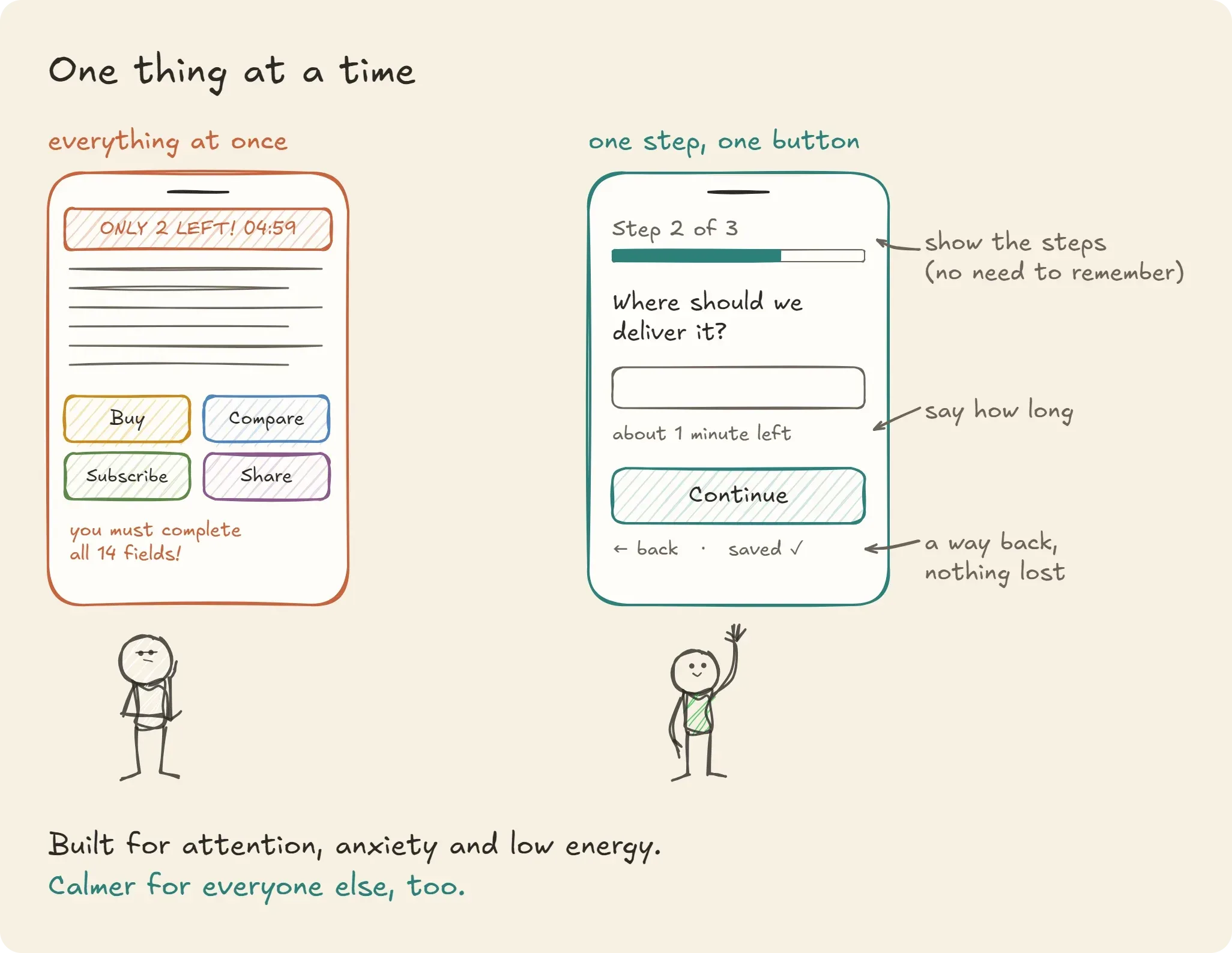
- One main action per screen. Several competing buttons cost a decision; a decision costs energy; energy is what's short.
- Show the steps, don't make people remember them. "Step 2 of 3", a visible summary of the basket, the info from the previous screen still in sight. Working memory is fragile, especially when a notification just pulled someone away.
- Instant, visible feedback. A tap that does nothing for a second invites a second tap, or a tab switch.
- Let people capture and come back. Save drafts automatically. Never punish an interruption.
For anxiety
- Say what will happen before it happens. "This takes about 3 minutes, in 3 steps." Uncertainty is the expensive part.
- Always offer a visible way out, without penalty: back, cancel, pause, "decide later".
- No fake urgency. Countdown timers, red banners and "only 2 left!" for things that aren't critical push anxious people out, not forward.
For low energy (depression, fatigue, a hard week)
- Short sentences, one idea at a time. Walls of text are skipped.
- Smart defaults, so someone can move forward without making every decision.
- No guilt. Messages like "You haven't logged in for 3 days!" or a broken streak shown in red hit much harder than intended.
For people sensitive to movement
Let animation be switched off. WCAG's highest level (AAA, beyond what the law usually requires) recommends that motion triggered by interaction can be disabled, because non-essential movement can cause dizziness and nausea for people with vestibular disorders, and browsers already pass on the visitor's "reduce motion" setting (W3C, Animation from Interactions).
Words are interface too
The quickest win is often the wording. A few rewrites in the spirit of those rules, adapted to an ordinary website:
Instead of | Try |
|---|---|
"You must complete all fields to continue!" | "Two more things and you're done." |
"Warning! Your session will expire." | "Still there? We've saved your basket." |
"You haven't finished your profile." | "Your profile is ready to use. You can add the rest any time." |
"Invalid date." | "Please write the date like this: 21/10/2026." |
"Don't miss out! Offer ends in 04:59!" | "This price is valid until Sunday." |
Notice what the right column has in common: no blame, no alarm, a clear next step. Words like must, failed, missed and a row of exclamation marks feel like pressure, and pressure is exactly what makes some people close the tab.
A ten-minute check for your own site
You don't need a budget to start. Try this on your own site today, ideally on your phone.
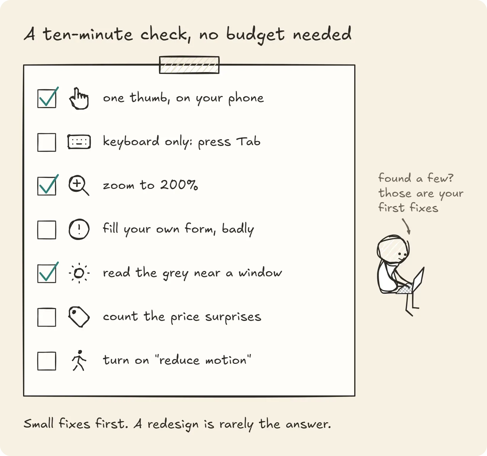
- One thumb. Do the main thing your site is for (book, buy, contact) on your phone, holding it in one hand. Note every moment you have to zoom or stretch.
- Keyboard only. On a computer, press Tab repeatedly from the top of the page. Can you see where you are at each step? Can you reach and press the main button?
- Zoom to 200%. Does the text reflow, or does the page break and scroll sideways?
- Fill your own form, badly. Make a mistake on purpose. Does the error say what to fix? Is what you typed still there?
- Read the grey. Stand near a window. Can you read every line?
- Count the surprises. Is the final price, or the next step, ever different from what the page promised?
- Turn on "reduce motion" in your phone's settings. Does the site calm down, or does it still slide and bounce?
If most answers are fine, your shop is in good shape. If several aren't, you've just found your first fixes, and they're usually smaller jobs than a redesign. If you'd like a second pair of eyes, ask me for a walk-through of your site.
The short answer: the walk matters more than the shop front
UI is the shop; UX is the walk through it. Visitors don't complain about a bad walk, they leave, and every person who leaves quietly takes with them the money it cost to bring them to your door.
None of this is about blame. Sites age the way shop fronts do: not because anyone did something wrong, but because the street changes around them. The fix is rarely a full redesign. It's walking through your own shop with fresh eyes, ideally someone else's, and smoothing the steps one by one, starting with the people who stumble first. When the walk is easy for them, it's easy for everyone.
Sources
- Baymard Institute, Cart Abandonment Rate statistics (updated 22 September 2025)
- Deloitte, Milliseconds Make Millions, and Google web.dev, case study
- Google web.dev, Interaction to Next Paint becomes a Core Web Vital (March 2024)
- Nielsen Norman Group, 10 Usability Heuristics for User Interface Design (1994, reviewed January 2024)
- WebAIM, The WebAIM Million, 2026 report (data February 2026)
- W3C, WCAG 2.2 Understanding pages: Target Size (Minimum) and Animation from Interactions
- World Health Organization, Disability fact sheet (7 March 2023)
- Noerr, Accessibility in e-commerce: new obligations from June 2025
- Tech Policy Press, What a Dutch court ruling against Meta signals for private DSA enforcement (8 October 2025), on Article 25 of the Digital Services Act
- Google, PageSpeed Insights; WebAIM, Contrast Checker
- W3C, Making Content Usable for People with Cognitive and Learning Disabilities (Working Group Note, 29 April 2021)
- Song P. et al., The prevalence of adult attention-deficit hyperactivity disorder: a global systematic review and meta-analysis, Journal of Global Health, 2021
- Illustrations drawn with Excalidraw; the people come from the Simple Characters library by Peter Hunter (MIT License), the icons from Tabler Icons (MIT License)
Loïc Simon is a freelance web developer in Brittany, France. He takes over, secures and documents web apps that were left behind by their original developers, builds new sites on headless CMSs, and writes about it at dev-relax.com. Figures and quotes link to their sources and were checked on 21 October 2026. Spotted a mistake? Tell him.